blog
5 Redesigning my portfolio app
The Experience page is live!
I have managed to create the experience page and make it look very close to the Figma design without too many issues
Feeling proud
The design of the experience section worried me a little because I knew I had to use several nested html div elements, and then use CSS to target their ::before and ::after pseudo-elements to achieve the desired look. That made me nervous because I dabble in CSS. Thankfully, the idea I had in mind worked and I am proud of the results
.EdContainer {
        display: flex;
        flex-direction: column;
        padding: 20px;
        width: 85%;
        min-height: 200px;
        float: right;
        border-radius: 8px;
        margin: 10px 0;

        &::before {
          content: "";
          width: 20px;
          height: 20px;
          border-radius: 50%;
          position: absolute;
          background-color: #333333;
          margin-left: -3.5rem;
          z-index: 3;
        }

        &::after {
          content: "";
          border-left: 2px solid #555;
          height: 315px;
          margin-left: -3rem;
          position: absolute;
        }

        .badge {
          background-color: #333333;
          width: fit-content;
          padding: 5px 20px;
          border-radius: 30px;
        }

        &:nth-of-type(odd) {
          background-color: #0f0f0f90;
        }
        &:nth-of-type(even) {
          background-color: #16161690;

          &::before {
            background-color: #fdc66b;
          }
        }
        &:last-of-type {
          &::after {
            height: 290px;
          }
        }
      }
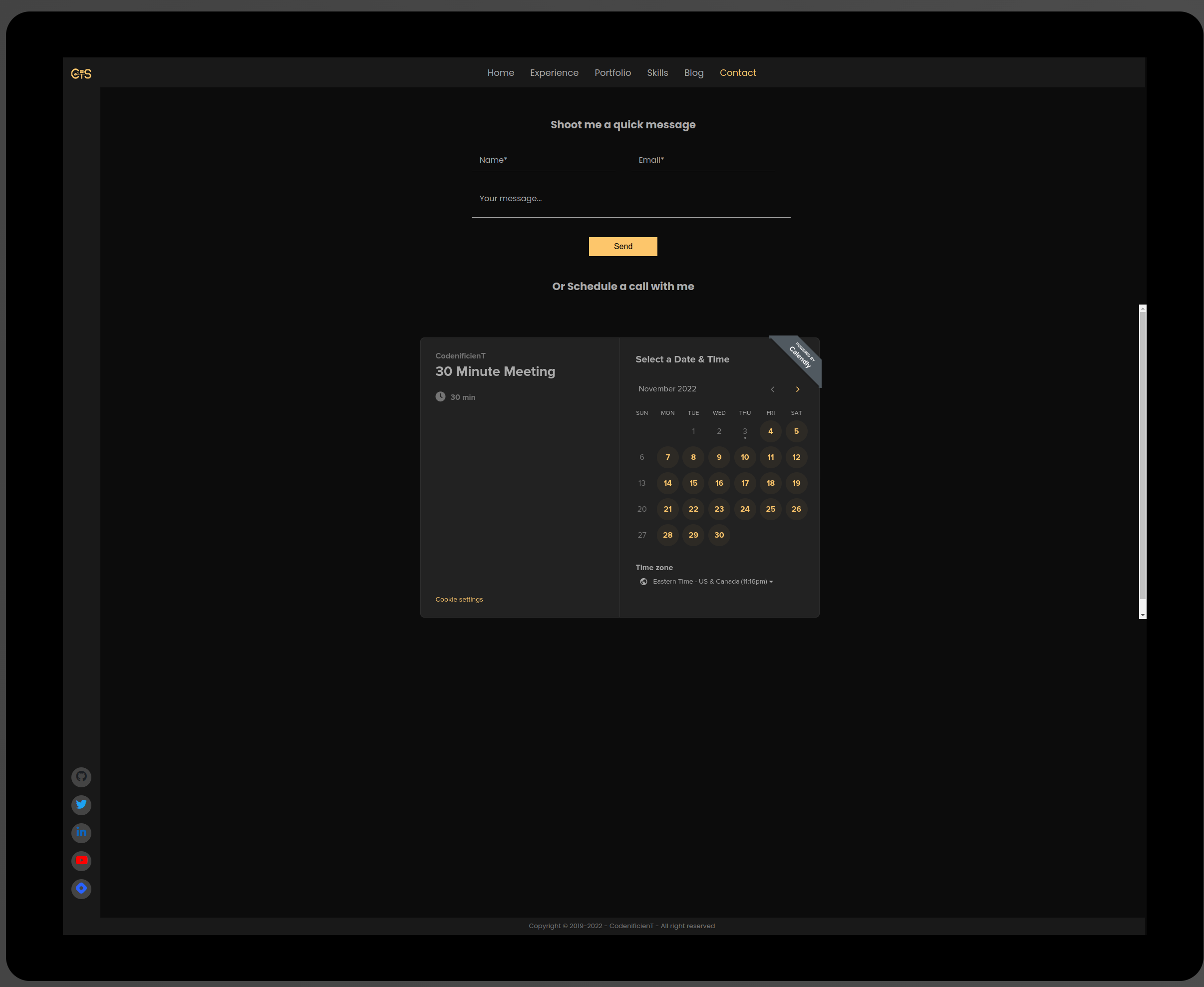
Started working on the Contact page
I have added the initial draft of the contact page and even pushed the preliminary changes to the live site.

I am still working on improving the look. All the pages show up flawlessly on my 43in monitor, but they are too big in my laptop screen.
This will take longer than I thought, but it's part of my learning process..
As usual, you can see the current version of the site at https://tioyedev.vercel.app/home